26.07.2026
A new look for the app: a navy sidebar, a quicker repairs list and bigger text
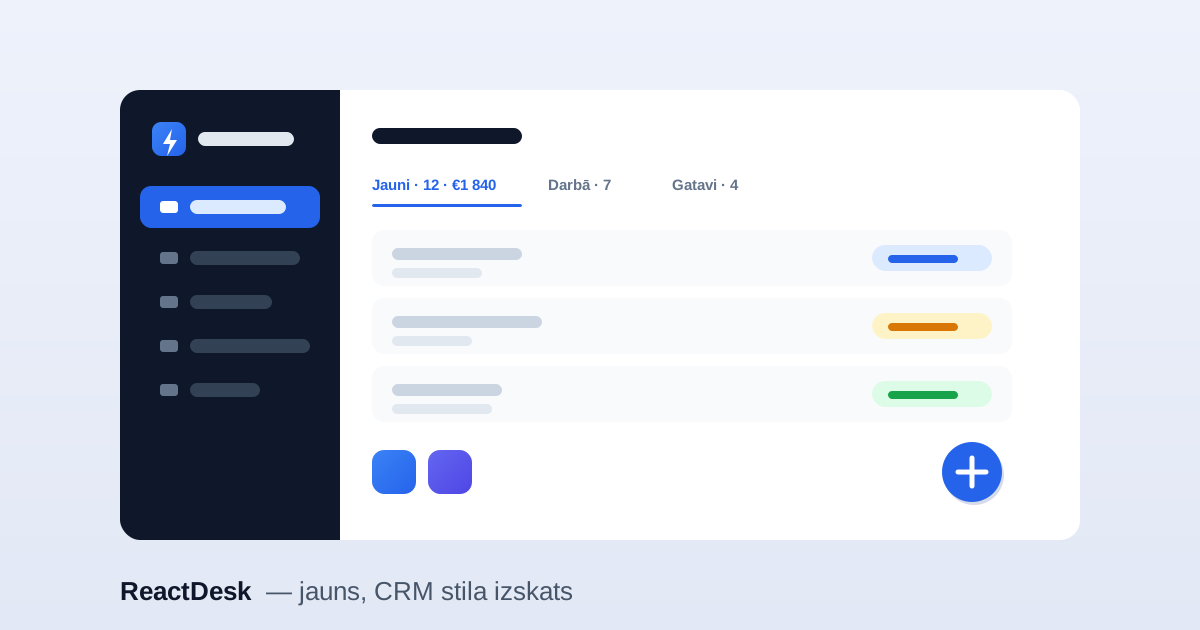
We redrew the whole app so that everyday work looks tidier and takes fewer clicks. Your data and the features are the same; what changed is how it looks and how quickly you get around. Here are the main changes.
A new look
The sidebar is now dark navy, and the section you are in is highlighted in blue. Settings sections and window headers have coloured icons, so you can find a section by its icon.
A quicker repairs list
Above the repairs list there is a tab for each stage, and each tab shows how many repairs are in it and their total in euros. You can change a repair’s stage straight from the list with its coloured status button, without opening the repair.
Bigger text and the full screen width
The base text is larger, and the text-size button (Aa) has a larger setting than before. Repairs, stock, clients and settings now use the full width of the window, so you see more at once.
A tidier header
The language choice is now one compact menu instead of a row of buttons. On tablets and phones the header tools (showroom, text size, theme, language, tour) sit behind a “⋯” button, so the search box keeps its space.
Stay signed in
The sign-in screen has a “Keep me signed in” box. Tick it and that device will not ask for your password for two weeks. Each time you tick it, you confirm the sign-in with a code sent to your e-mail.
All of this is available now, including on the free trial.